May 25, 2007
I find myself bothered by Pixy's strong negative reaction to the art style of the Ah! My Goddess! TV series. He says, in part:
The character designs for the TV series are off-model, inappropriate, and ugly. All the characters are very young. Megumi has just started college at the start of the story - she's only 18. Keiichi is only a year or so older. If that's an 18-year-old in your picture, she needs to book herself into detox, pronto.
Of course, some of this is just fanboy bickering. But I think there's something else going on here.
It's not uncommon for manga adaptations to anime to make changes in the character art. In the Fruits Basket anime, one of the things they did was to massively tone down the bishounen look of several of the major characters. The mangaka made all the males look androgynous. For a character who is distinctly macho like Kyo, that look was incongruous. Besides which, that art style would have driven away a large part of the potential audience.
They changed the character designs in Someday's Dreamers. In the manga, Yume isn't just cute, she's a total knock-out, the complete babe, tall and sexy and gorgeous. It turns out that the manga is quite short, too. In order to even stretch it to 12 episodes they had to create quite a lot of story and include several new characters. I think they realized that if Yume was too cute it would distract from the story, since one of the decisions they made was that they were not going to include any romance sub-plot for Yume. If, in the anime, Yume had looked like she did in the manga, there would have been guys swarming all over her. (Or the audience would have wondered why there were not.) The attention Kera ended up paying to Yume would have seemed less innocent, less about just being buddies (which is how it actually does come off in the anime).
It's true that the character art in the AMG movie and TV series is different than in the manga and the OVA. It's true that the OVA is more true to the manga. But the manga character art is more neotenized. For whatever stylistic reason, all the characters have baby faces.
Kids' aren't proportioned the way adults are. Kids faces are not shaped like adult faces, and kids' bodies aren't the same. There's been a trend in anime to loli-ize characters who really should be grown up. In this year's series Manabi Straight and in the currently-running Lucky Star, the characters are high school students but they all look like they're ten years old, except with boobs.
The five main characters in Petite Princess Yucie are all 17 but have the bodies of ten year olds, but that's a plot point and it's only those five. Furthermore, it's recognized by them and everyone around them as being the result of a magical curse. There's no such in-plot explanation for why the characters in Manabi Straight or Lucky Star look like that.
Those are extreme cases, but in general characters in recent anime are more neotenized. The biggest difference between an adult and a child is the ratio of head size to body size. That's also the difference between short people and tall people. A tall person's skull will be larger than a short person's skull, but it scales at a lower rate than body size, which means a tall person's head is proportionally smaller though absolutely bigger.
That's why you can look at a picture of a person and figure out if they're tall or short even without any visual context.
Pixy says that the characters in Ah! My Goddess! are "young" -- but they aren't young. They're college age, and in the movie and TV series they're drawn proportionally as adults. He complains that Megumi looks like she's 29 -- but if she's 18, then physically she is the same as she'll be when she's 29. By age 18 a girl is fully grown.
The character art is a plot point in the series, because one of the stories is Skuld's resentment at being treated as if she's a kid. She is the big exception; she's shorter than everyone else by quite a lot, and she's also drawn more neotenized, and there's a deliberate artistic contrast between her and everyone else including Megumi which is intended to emphasize the fact that she's very young.
One episode of the TV series is the "battle of the kid sisters", and part of the foundation of that episode is that Megumi seems in every way to be much more adult than Skuld is. If Megumi had been drawn the way Pixy wants her drawn, that episode wouldn't have worked as well as it did.
There's another episode, the 26th, where this art style is even more critical for Skuld as a character, but I can't really explain why without spoilers.
On a deeper level, this show isn't about puppy love. This isn't high school romance. This is supposed to be a love story about adults. And I think it's important that they be drawn like adults; it helps get that point across.
It seems as if the only way some artists can make a female human look adult is to give her boobs like the ones in Divergence Eve. But another important point in AMG is that the women vary a lot in that regard. Again, that's in service of the plot: there's a contrast between Urd, who has a magnificent chest (and knows it) and pretty much everyone else. As it turns out, Megumi is quite slender and isn't at all top-heavy; and that's realistic. (The substantial variance in tit size also sets up another joke, when one character suddenly grows tits which rival Urd's in size.)
Pixy is, I think, reacting first to the series history and objecting to the changes that were made. (Fanboy loyalty.) But he's also reacting to the current anime context where "adult" girls are being drawn more and more young looking, a kind of genre-wide pervasive lolicon. Within that context, Megumi as drawn in the TV series looks scandalously mature, even old -- but only because the context itself is distorted. Megumi doesn't look 29; she looks 18. The reason she looks out of place is because so many other girls that age (or slightly younger) in anime are drawn to look 12.
UPDATE: Some pictures below the fold.
UPDATE 2: Spoilers below the fold.
The difference in art style between Skuld and everyone else is the source of one sight gag. Urd senses that Skuld is hiding something and needles her by imitating something that Skuld would say. The seiyuu makes her voice sound like Skuld's voice, but they also change Urd's face art so that her face has the same proportions as Skuld's:
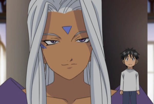
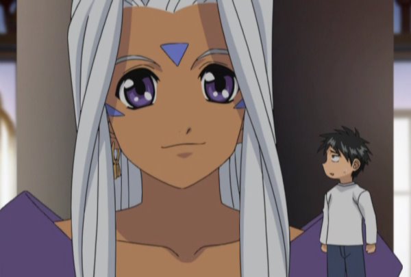
That gag wouldn't have worked if everyone had been drawn like Skuld is. And everyone is drawn that way in the manga and in the OVA. Irrespective of body proportions, they all have the faces of kids.
(There's a scene like this in Petite Princess Yucie too, except that one's not intended for comedic effect. At one point in unusual lighting, someone looks at Yucie and suddenly her face seems to change. The proportions are different; it's still recognizably Yucie, but it's Yucie as she will look as an adult.)
UPDATE: So let's see if I can make the "Spoiler" tag work.
Posted by: Steven Den Beste in Engineer's Disease at
03:11 PM
| Comments (7)
| Add Comment
Post contains 1257 words, total size 9 kb.
More than old/young, Urd's eyes make her look devious/(falsely) innocent in these pics. Without context, or knowing what the character designs (or character personalities) are *supposed* to be like, I wouldn't necessarily see any distinction in age between the two... but that's just because I've seen too much Big Eye anime (confession: Haven't seen AMG, but I am familiar with the characters and story--it's on my list).
For me, 14-18 has a definite difference in body proportions (most of the time--there are some people who just look dang young), but the *real* difference is 20-26. When I was in college, I could always tell the difference between students and alumni, even if they had only graduated a couple of years ago. For most people (again, there are some lucky exceptions, but I haven't seen very many), your face simply expands around 24-26. That's where you see the real change between big eyes and small eyes. I watched it happen (with great displeasure throughout the whole process) in the mirror, as well.
Posted by: Big D at May 25, 2007 04:15 PM (JJ4vV)
So I guess I'm disagreeing with both you and Pixy here.
Posted by: Joe at May 25, 2007 04:56 PM (jPO02)
 ) but my comment was getting a bit long, so I posted it here. By the way, I think the movie is gorgeous, even though the characters look older there than in the OVA. Of course, that's largely because the move is gorgeous. Whereas if you rounded transvestite-Megumi's face and eyes, she'd still look ugly and flat; younger, perhaps, but still ugly.
Posted by: Pixy Misa at May 25, 2007 07:07 PM (PiXy!)
It's worth noting that You're Under Arrest saw a similar progression. The OAV designs were classic Fujishima Kousuke, but they were simplified for both seasons of the TV series. The movie designs, meanwhile, were a hybrid of sorts. In the case of YUA, however, I have to say I prefer the OAV designs over those of the TV series. I'm curious what the designs for the newly announced third season will look like... they're sticking with the same character designer, at least.
In the end, though, I suspect Fujishima's character designs simply don't adapt all that well. Back in the day, people used to joke that the only thing preventing an AMG TV series from being produced was the fact that a standard TV budget couldn't support animating Belldandy's hair. It wouldn't surprise me if there was indeed some truth to that. What looks like a stylistic choice on the part of an art director or character designer is often, in reality, a choice made with the constraints of the production budget in mind.
I actually know someone who is a friend of Matsubara Hidenori (the character designer and animation director for the movie and TV series). Perhaps I should ask her if this topic has ever come up in conversation.
Posted by: Jeff Lawson at May 25, 2007 07:42 PM (VgF1Y)
Jeff wrote:Yes, that's what I'm getting at, or at least part of it.The TV series designs actually bugged me at first, even if the ARE merely a simplified version of the movie designs... the faces lacked depth.
Also, they changed the opening theme! :x
Posted by: Pixy Misa at May 25, 2007 08:18 PM (PiXy!)
Posted by: Pixy Misa at May 25, 2007 08:19 PM (PiXy!)
("To be blunt, the secret of her popularity is because of her huge boobs which look so imbalanced with her lolita face") Another example would be Tenjo Tenge's Aya Natsume (and most of the other female chars). A funny event in the manga occurs when Matsuiro Tokuan Shoujou, a female shapeshifter, takes on Aya's appearance and mocks her.
Fujishima Kousuke did a pretty good job on the char designs for normal middle school girls in the slice of life OVA Piano.
Posted by: Jim Burdo at June 01, 2007 11:27 PM (qk+He)
Enclose all spoilers in spoiler tags:
[spoiler]your spoiler here[/spoiler]
Spoilers which are not properly tagged will be ruthlessly deleted on sight.
Also, I hate unsolicited suggestions and advice. (Even when you think you're being funny.)
At Chizumatic, we take pride in being incomplete, incorrect, inconsistent, and unfair. We do all of them deliberately.
How to put links in your comment
Comments are disabled. Post is locked.21 queries taking 0.0099 seconds, 24 records returned.
Powered by Minx 1.1.6c-pink.